To help you save time, we have prepared a list of the best fonts for resumes & resume fonts which you should avoid. Along with what are their specialities & where they could be used.
Picking the fonts for resume may appear as unimportant. But this little choice could make a huge difference, between landing in a potential job interview & passing up a major opportunity and regret later kind of difference.
No font is perfect, every font has its usage in some way or other. But here we are focusing on the best fonts for resumes. So we will talk about it considering this in mind.
Selecting the best font for your resume will also depend upon what industry you are going applying into.
Table of Contents
Best Font Size For Resumes
Try making your headlines an overall combination texts in Bold, italic, CAPITAL & underline texts. Use Fonts that are easy to read & understand as that will ensure that whatever impression you want to leave on the person is good & right.
Using anywhere between 12 points up to 18 points is perfectly safe.
Be that as it may, it is essential to understand that some font styles which are suitable for something might not be suitable for the other. Consequently, it’s essential to make a judgment on the font size after you’ve just chosen font from the best fonts for resumes list.
Keep it simple & readable. Avoid messing around with sizes & weights too much that it starts to look like something you might consider changing. You’ll need to utilize your best judgment when choosing the size, weight & the type of font.
Another significant thing to remember is the font size relative to your resume length. The size of the font can drastically change the length of your resume, utilize this correctly to your advantage.
Types Of Fonts
There are 3 categories under which all the fonts are categorized. Each has its features, look, feel & attributes due to which some can be more effective in certain places as compared to others.
The 3 font categories are:
- Serif Fonts
- Sans Serif Fonts
- Decorative
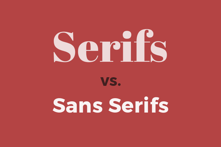
Serif Fonts
The small features on the ends of strokes in some fonts are what is known as the serifs.
They are very classic & sometimes formal & some are even elegant. They are widely used for body texts which means that these fonts are suitable for body text rather than headlines.
So, when selecting from serif fonts keep in mind that you will be using these fonts mostly for body texts like to describe something in your resume. Your strengths, achievements & a little introduction about you.
Sans Serif Fonts
These fonts stand out in large titles. On computer screens currently, it is still the best to use mostly sans serif fonts.
They are modern & have a friendly and minimal vibe associated with it because they have this stylish simplicity about them. They are mostly used & are ideal for titles or headlines.
When choosing among sans serif fonts, you should keep in mind that you will be using it often for headlines & headings to define a section under which you can use serif fonts to explain further in those sections. That combination will make your resume look & feel better.
Decorative
All those stylish, cursive, unique looking texts that you might have seen in music videos, advertisements come under the decorative text category.
What Your Resume Should Look Like?
Now that you know the basic types & features of fonts, let’s get started with the list.
However for resume’s you should better avoid using the decorative text & instead make your resume by using serif & sans-serif font categories only.
Here Are The Best Fonts For Resumes
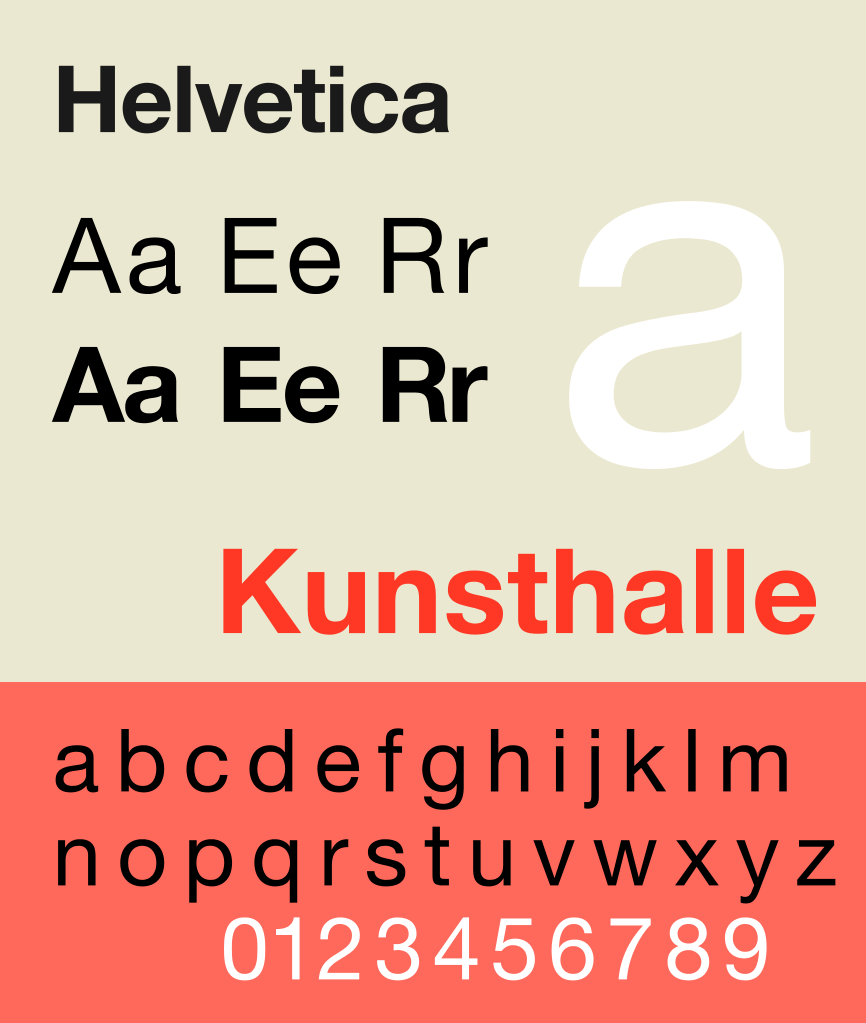
Helvetica
This font is loved by designers & typographers because of its clean & modern vibe associated with it.
It is also used in many brand logos including
- Panasonic
- Jeep
- BMW
- Microsoft
If you want to convey a professional, lighthearted & honest impression then go for it. It is also one of the favourite fonts of recruiters & hiring managers. Thus, landing on our the best fonts for resumes list.
Raleway
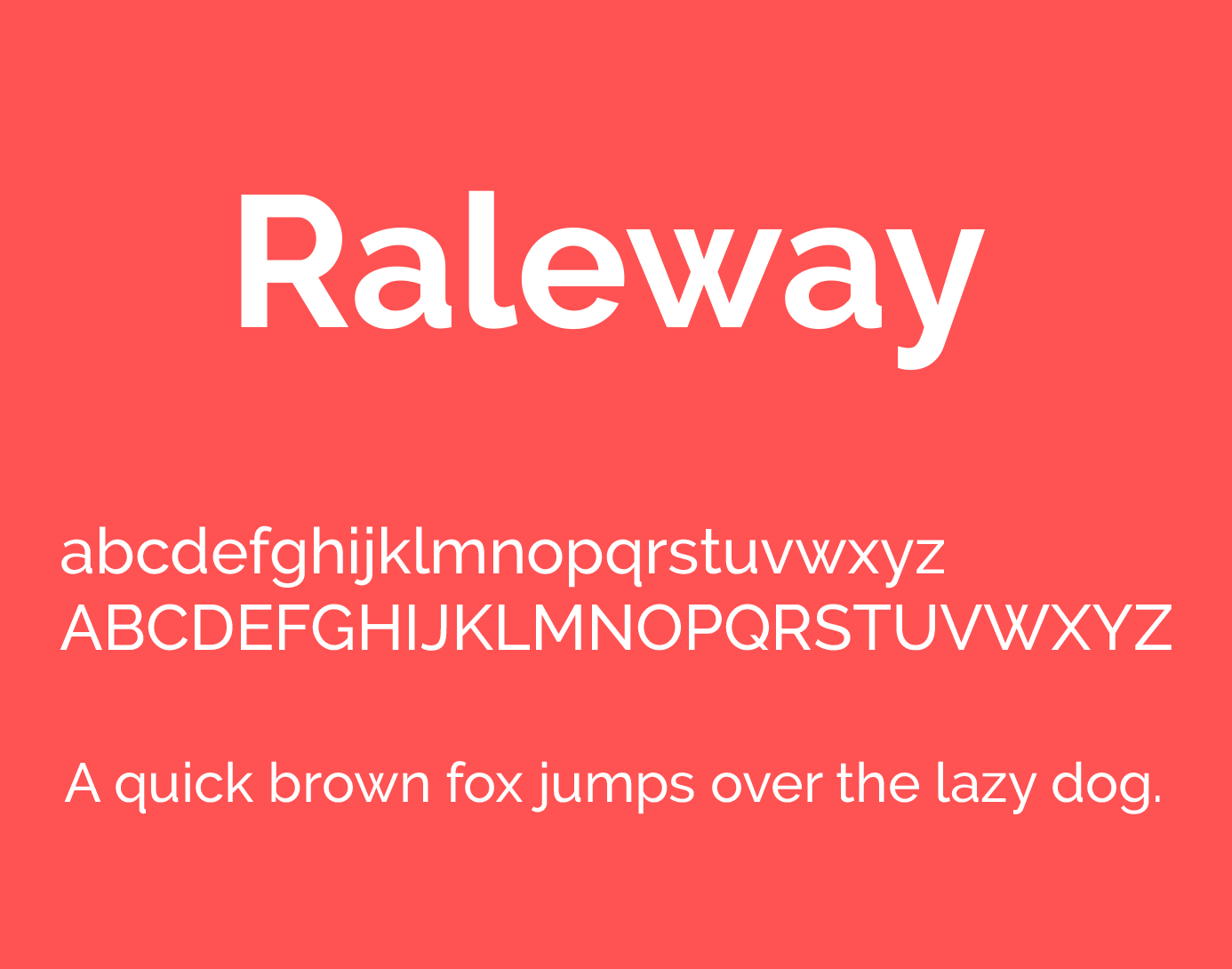
This font belongs to the sans-serif typeface family. It works well on headings & large sizes. Raleway was initially made by Matt McInerney as a single thin weight but later in 2012, was expanded into 9 weight family.
It has an elegant & sophisticated vibe to it.
So, if you want to leave an elegant type of impression then this will help you have that impression by using this font for resume.
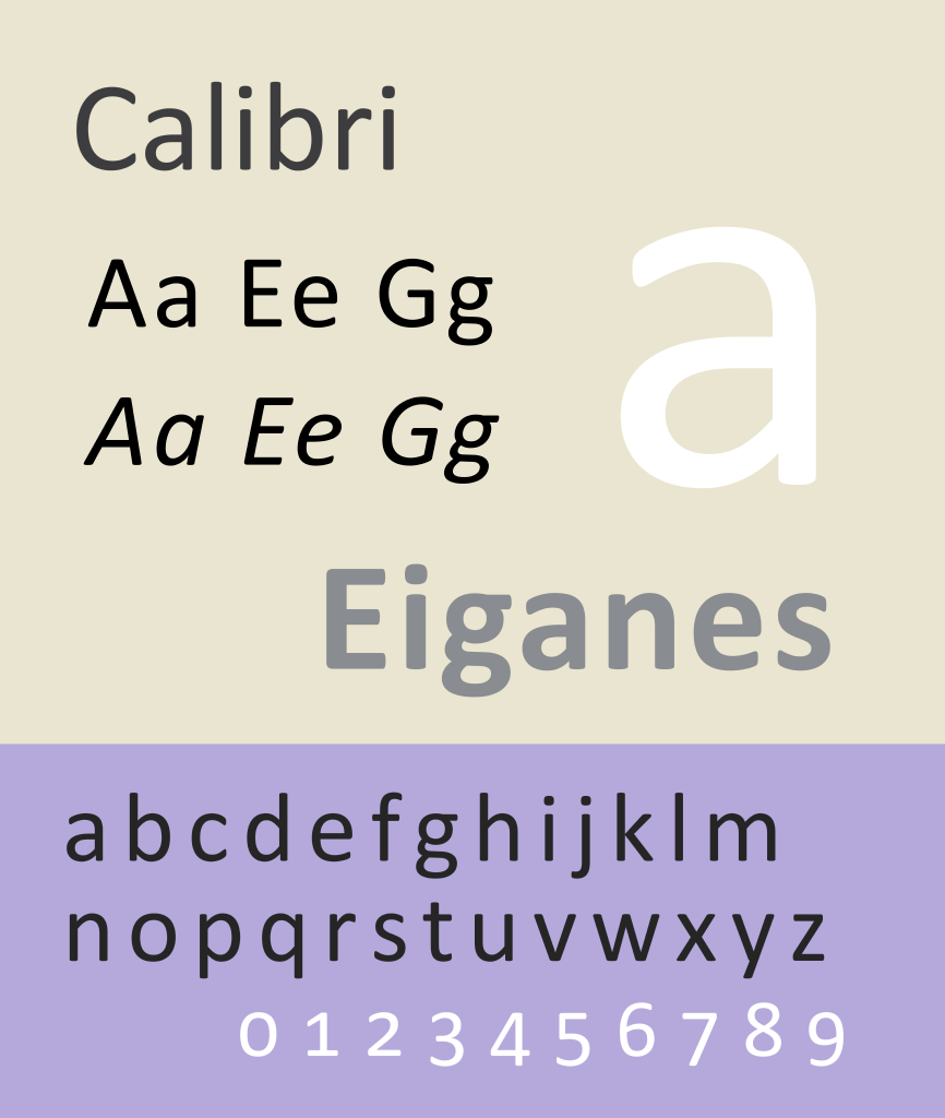
Calibri
Calibri font is very readable sans serif font. Many professionals who are expert at making resumes also recommend this font & one of its advantages is that it looks smooth on computer screens.
This font is one of the fonts that was designed specifically to perform well on computer monitors.
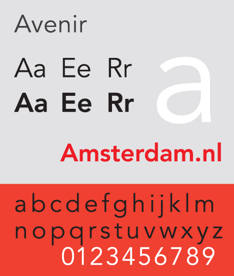
Avenir
This is of sans serif font category & has a clean and crisp look to it. Besides the “book” & “light” weight options that this gives you to choose from you can choose anyone you like.
You should also avoid condensed versions of it as they could be hard to read.
It supports multiple weights through which you can create sections & features in your resume.
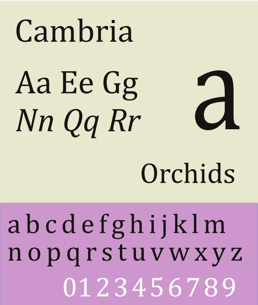
Cambria
This font was also designed to work well with computer screens & printing even at small sizes.
Cambria is also referred to as the “new Times New Roman” & is used for online & printing purposes. Being professional & modern looking as compared to some other fonts makes is ideal to use it on resumes.
It is also a great choice for resumes & cover letters.
Also, it has a very traditional feel associated with it. You should use this font if you are applying for a job in fields such as law, banking, accounting. In simple words fields which are traditional.
Garamond
If you want a font that has an old-style & vibe associated to it then this is the font made for you. This is great for academic resumes & for those who have years of experience & want to convey it subconsciously through their resume.
The modern version of Garamond has a classic & a polished look which makes it even more interesting.
If you want to stand out classically then this is the font which you should use.

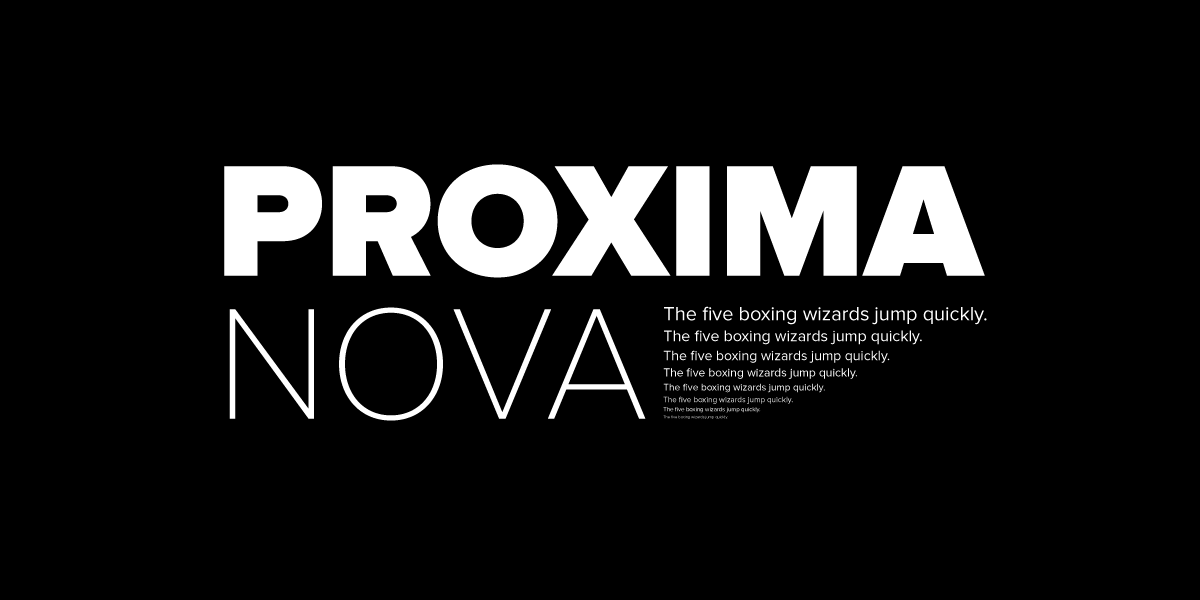
Proxima Nova
This font family is a complete remake of Proxima Sans which was created in 1994. It supports a lot of weights through which you can use to help define sections in your resume.
It has 3 widths Proxima Nova, Proxima Nova Condensed & Proxima Nova Further Condensed. But for your resume, we recommend that you stick to the Proxima Nova.
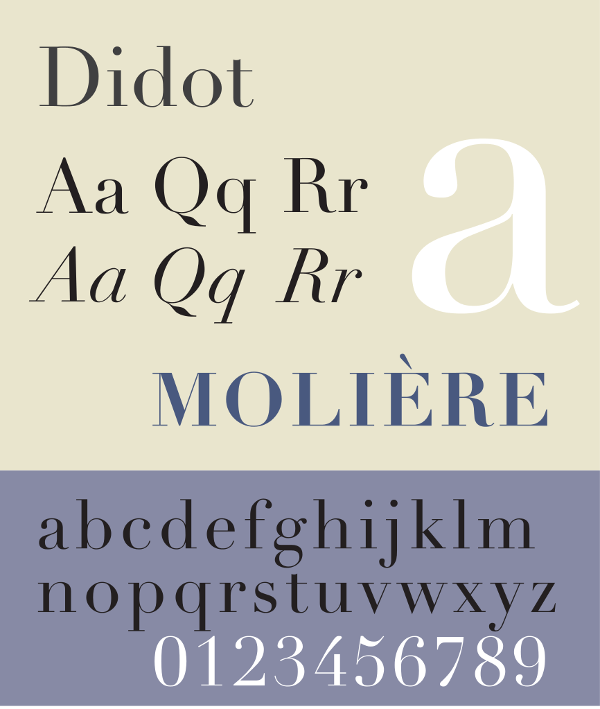
Didot
If you work in an industry like photography, fashion, video editing then Didot font is for you.
It has a distinctive & classic feel to it & this is ideal for headings or headlines in your resume but not more than that, you should avoid using it in body text.
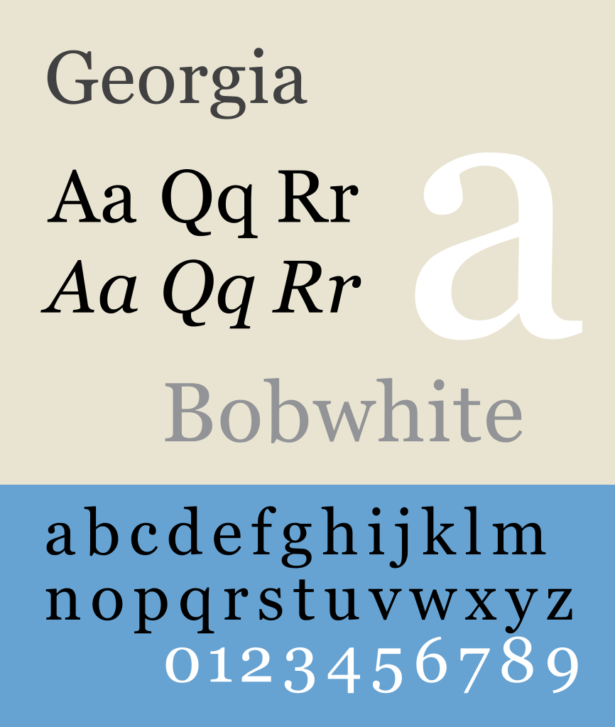
Georgia
This is another traditional looking font & it is pleasing on eyes & computer screens. Readability is one of the strengths of this font.
It is easy to read this font even at small sizes & if you are sending your resume in formats like Pdf, doc, Docx then it is ideal for your resume.
Book Antiqua
This font has a distinctive & gentle style associated with it & is easy to read on screens.
If you are applying for a creative or cultural role then you should go for it.
You can view this font here.
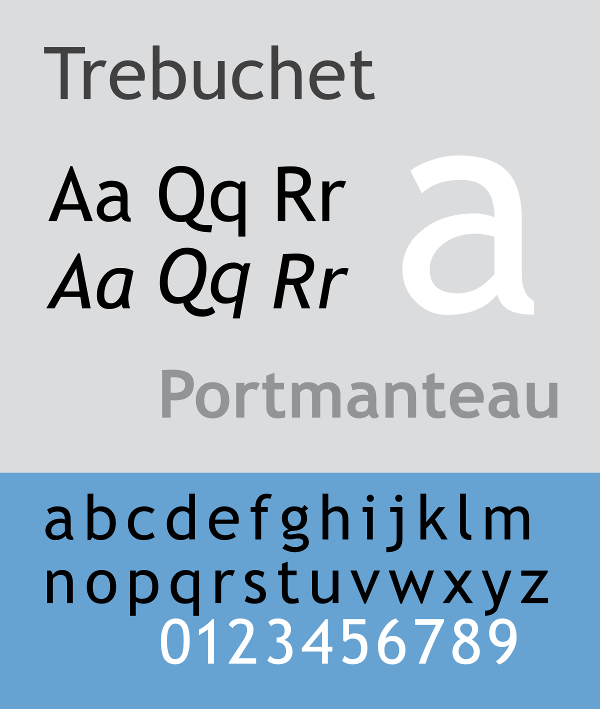
Trebuchet MS
It has a textured & modern looking feel to it as compared to other traditional resume fonts & is ideal for people who are applying for entry-level jobs & also for freshers.
Is ideal for marketing, sales & social media roles.
Also Read: How To Be More Photogenic – 6 Tips To Look Good In Photos
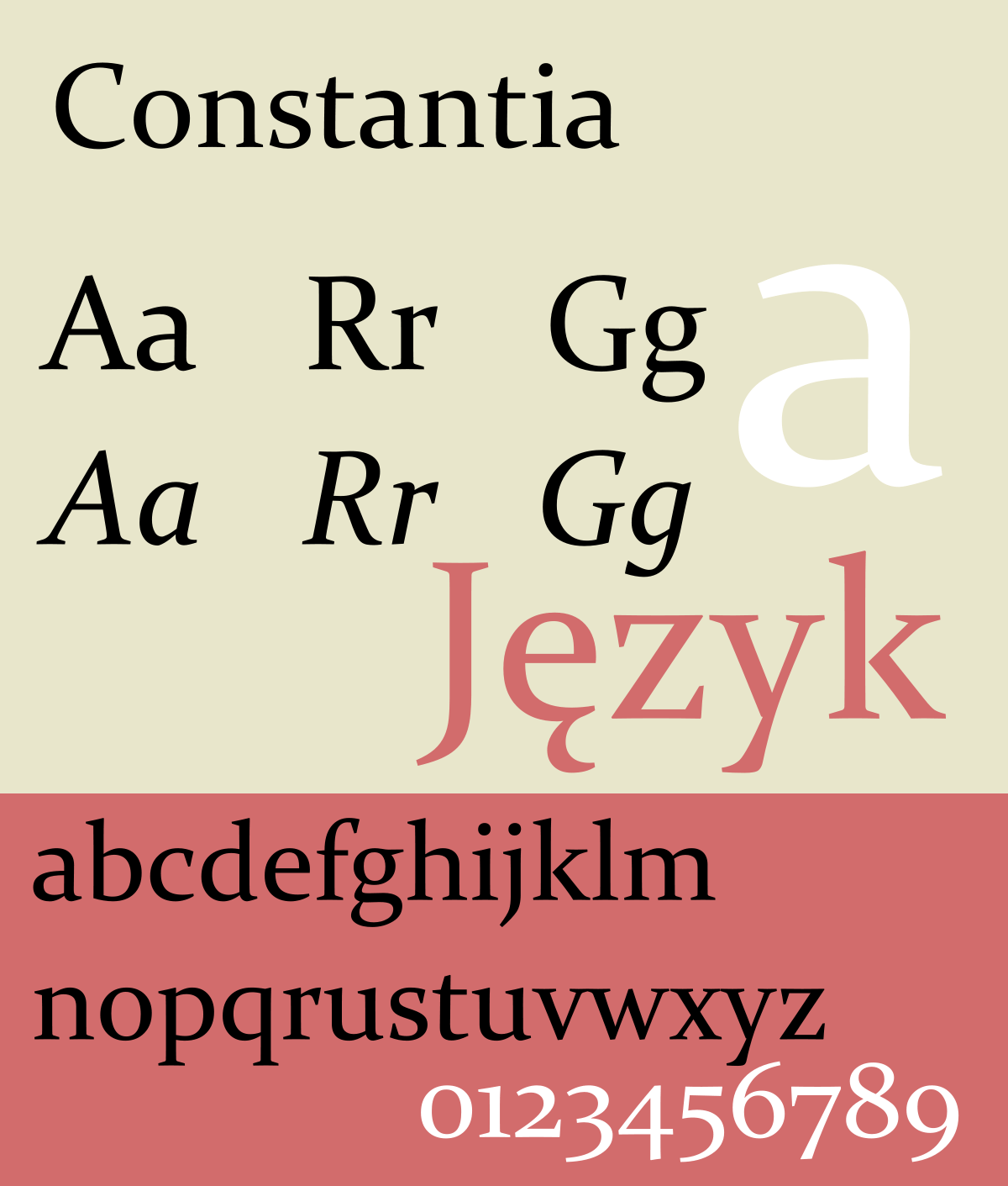
Constantia
This font is very ideal for those people who want to distribute their resumes in digital as well as a printed format. It is very sophisticated as compared to many serif typefaces.
It has good readability both on-screen & in printed format.
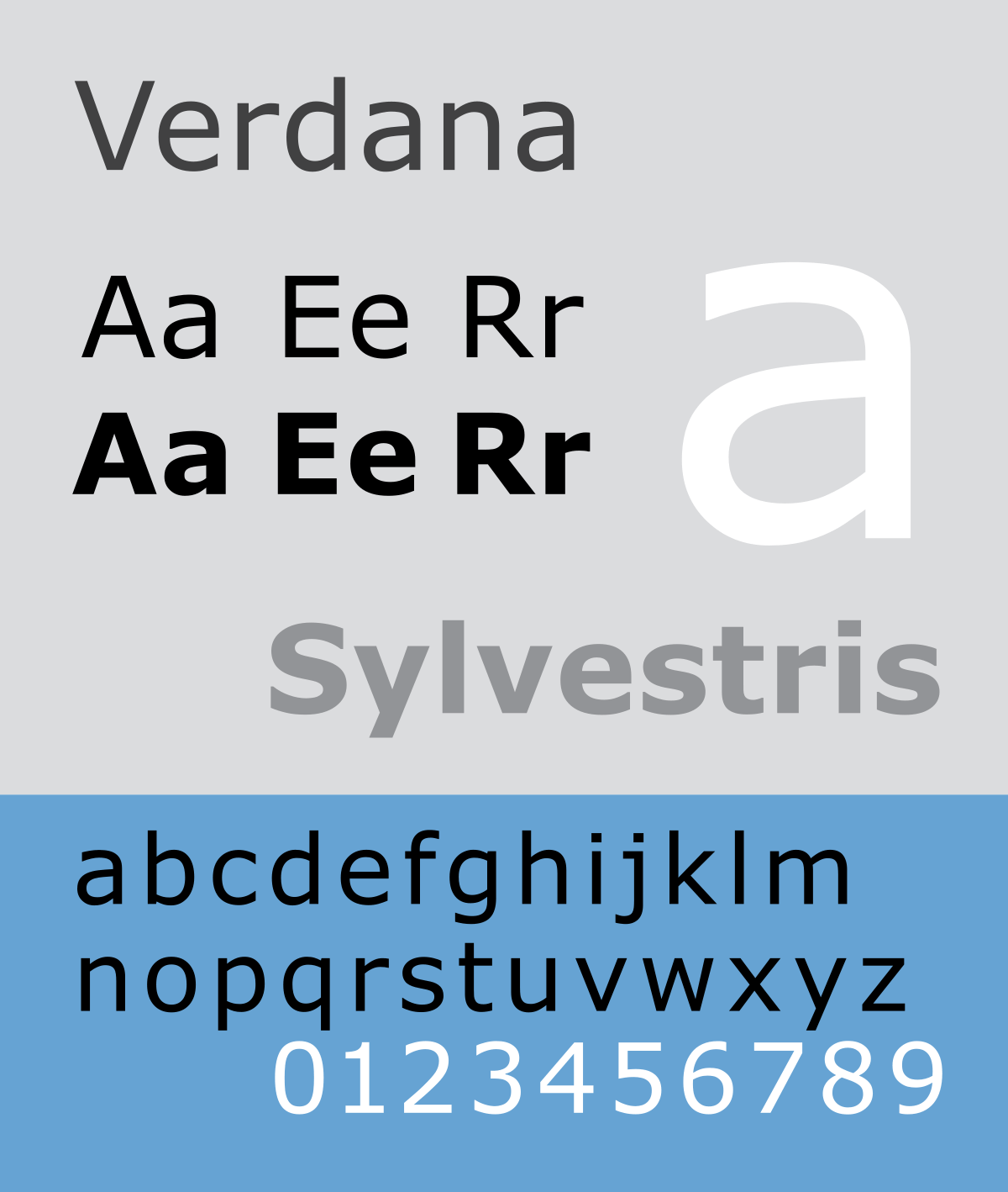
Verdana
This is another good option to choose for your resume.
As it was designed to appear well on small screen’s as well as screen’s with low resolution so if you use this font you can be assured that the text on your resume will appear readable no matter what.
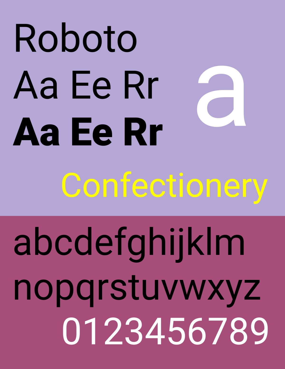
Roboto
Roboto has a friendly vibe associated with it. With its open curves & natural-looking style, it is one of the resume fonts which you should try to use & if it fits well then it’s well & good.
Otherwise, you have many options which you can choose from the list. In addition to this, Roboto is readable at various sizes.
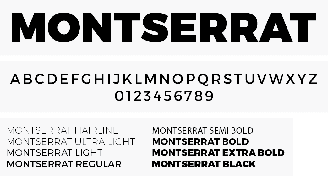
Montserrat
The traditional Montserrat neighbourhood of Buenos Aires inspired Julieta Ulanovsky to design this font. It has 2 sister families “Alternates” & “Subrayada” which you can also check out.
Later this family was redrawn by Jacques Le Bailly & adjusted the full set of weights to make the “Regular Weight” lighter & to work well with longer texts.
Try to use it in only headlines instead of body text.
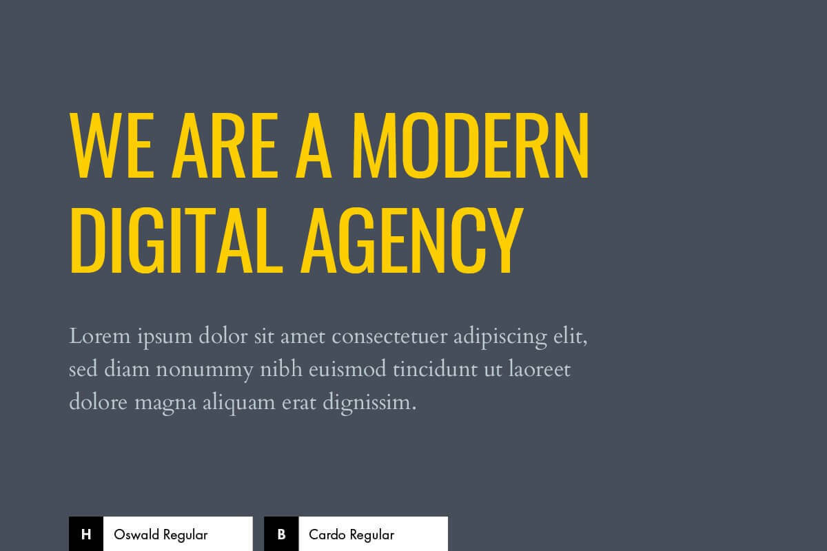
Oswald
If you are tempted to use the font Impact which many do not recommend to use. Then here is an alternate choice for you. It works well with headlines or headings & also body text.
If you are applying in the publishing industry or for some type of publication role then you should try this font for your resume.
It was also made to work well on computer screens, laptops & mobile devices.
Fonts For Resume To Avoid
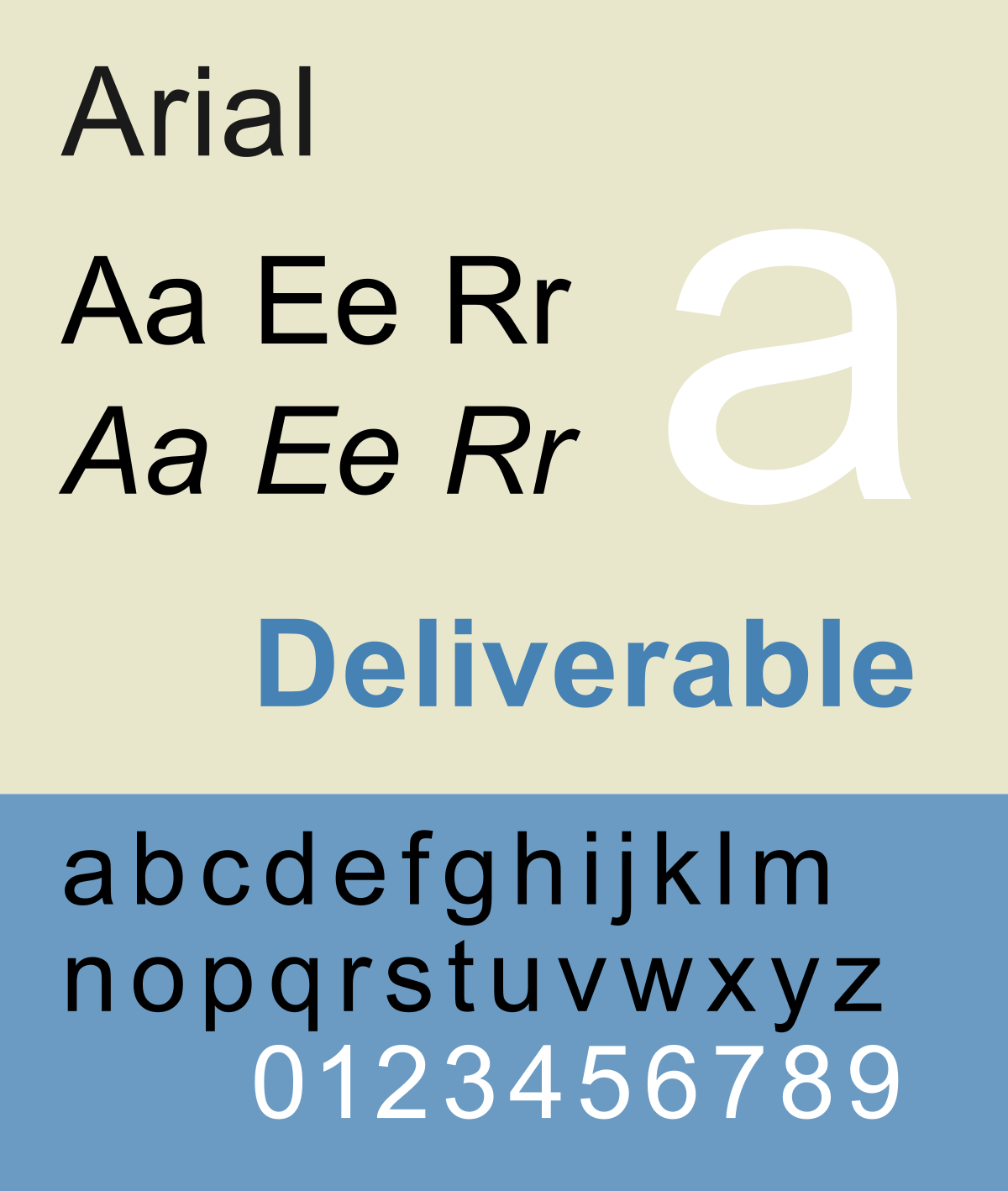
Arial
Arial is also one of the most overused fonts just like Times New Roman. Its style is very normal & if you use this font you might even be perceived as lazy or as unfit for the job which is definitely what we don’t want.
The first impression is the last, so make sure you don’t ruin it by using this font. Also, this font is not bad it’s just that it won’t work or will be effective on your resume.
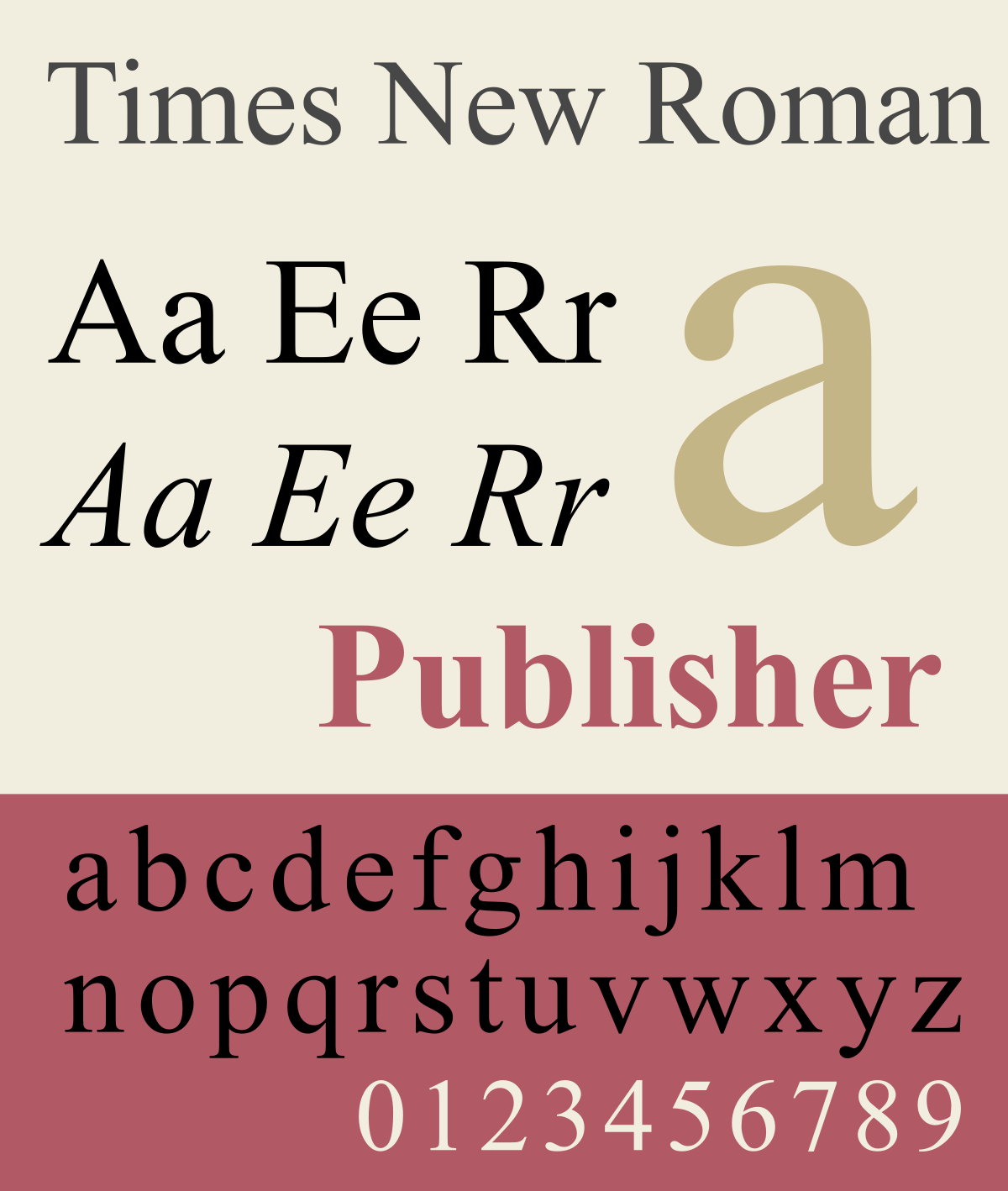
Times New Roman
There’s nothing wrong with the text style in itself, it’s simply that it has been overused and misused. As every other person is using it on their resumes so yours won’t stand out from the crowd.
Times New Roman is also difficult to read at a small size and doesn’t work well on screens.
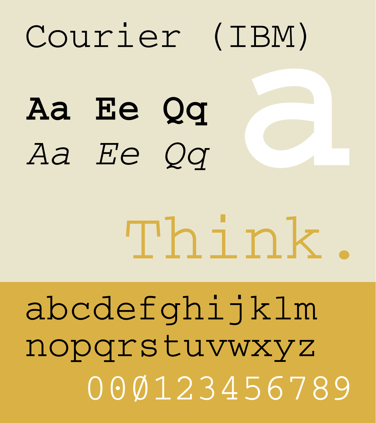
Courier
Unless you want to replicate the appearance of a typewriter you better not use this font. If you use this font your resume will look like you made it with a typewriter.
All kind’s of stuff can come to the recruiters which could work against your goal. Since this is a monospaced typeface & each letter is divided similarly it looks kind of unnatural.
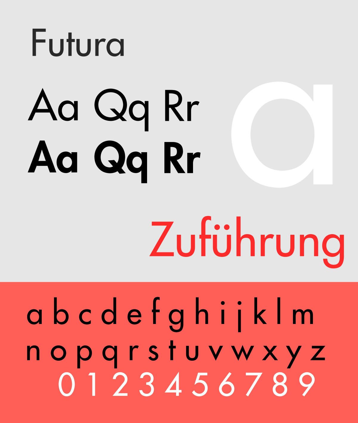
Futura
This sans-serif typeface was made in Germany. Even though it’s clean & has an alluring text style, the overall appearance of this font is somewhat unnatural.
With idiosyncrasies like bizarrely tall lowercase letters and clashing contrast among sharp and round letter shapes, this font should be treated more like decorative text and for decorative purposes, rather than professional (which is what we want our resume to look like – Professional).
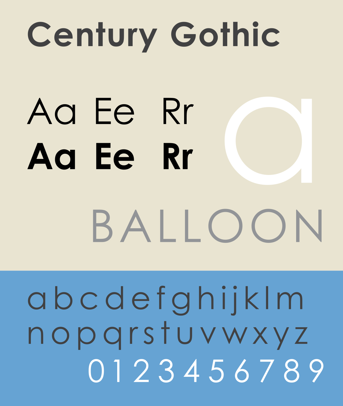
Century Gothic
Century Gothic has a sleek, modern look. The thin letters of this font’s regular weight can be hard to read, particularly at small sizes, which will be bad if you are sending your resume through email or any other digital media.
You need to make sure that whatever you have written on your resume is readable.
Brush Script
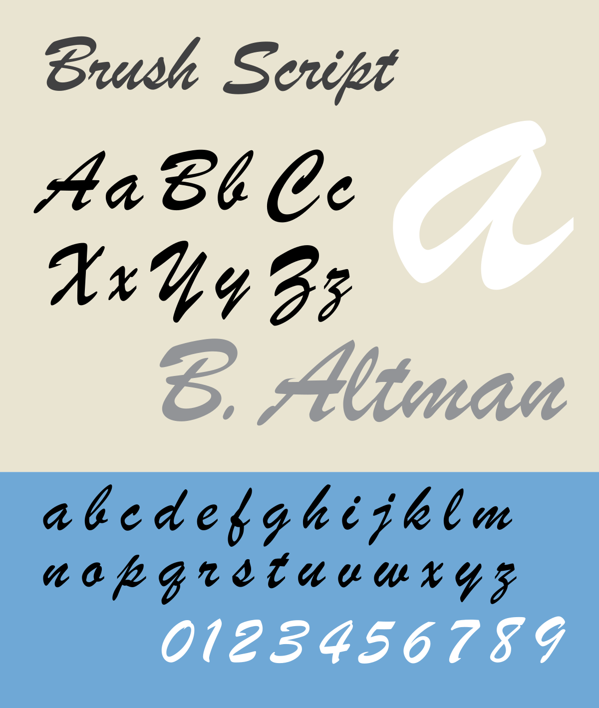
Don’t use Brush Script, it has been so overused so much that now it looks cheap and old.
While you may want to use it to make your resume look a little artistic. It will make you perceive as lazy. As in resumes that will just throw off any professionalism feel that you might want to convey through your resume.
Comic Sans
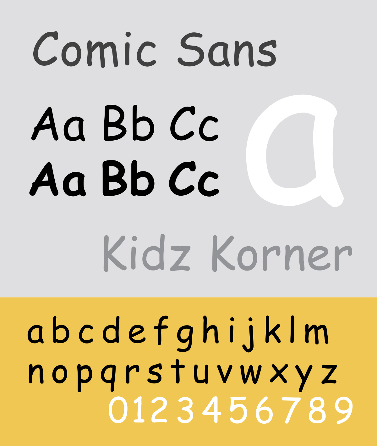
The casual, almost childish look of the font makes it distracting in any serious context. And in case you’re wondering why anyone would use Comic Sans on a resume, it’s a good rule of thumb to stay far away from any font that might come across as childish.
Papyrus
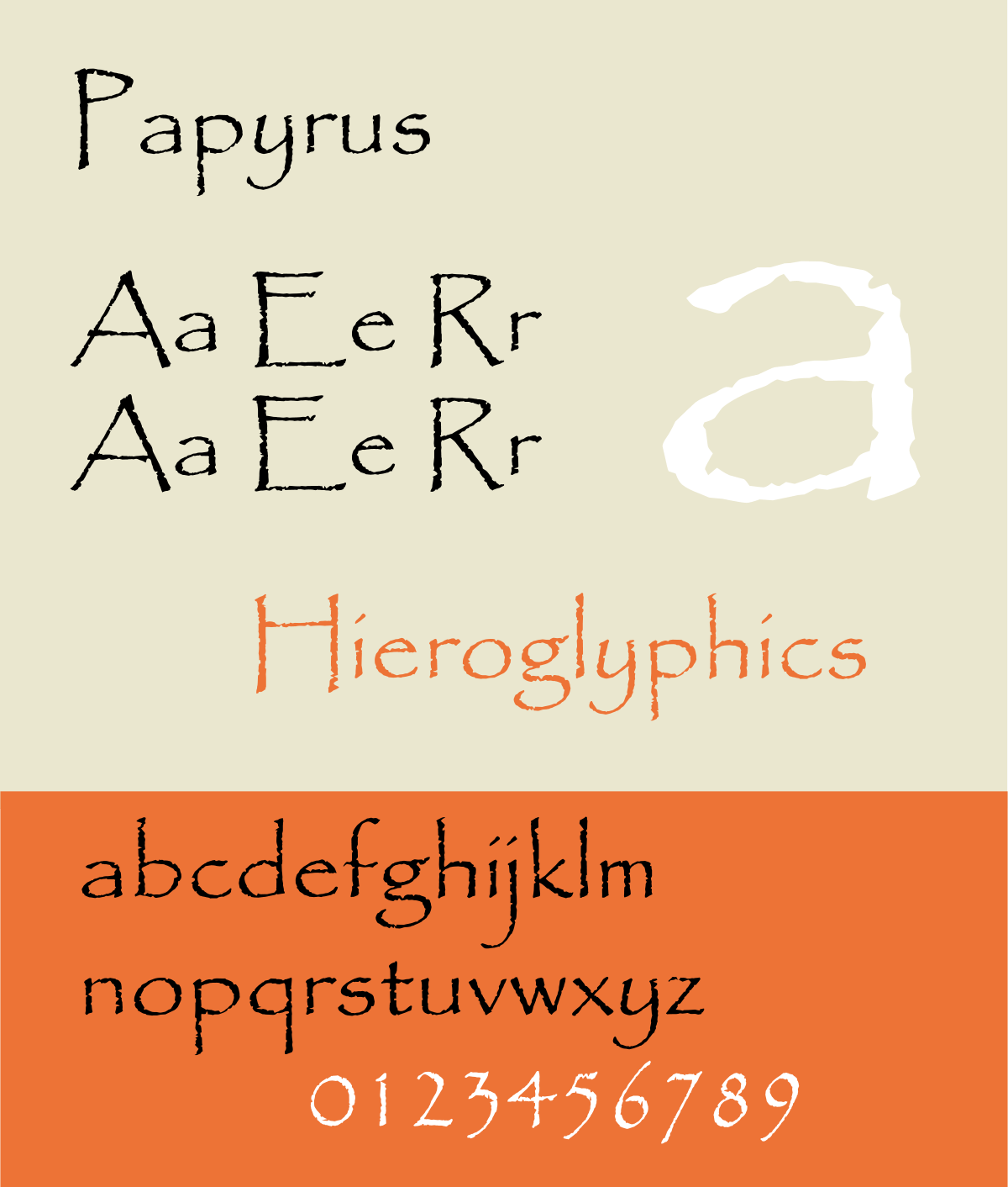
Nobody should use this font on a resume especially their resumes.
It has an antique vibe to it, its like that one thing which is lying around your house or storeroom which doesn’t work and even you don’t know why you have still decided to keep it.
Jokes apart, this font is not suitable for resumes but if you are in a mood to have fun then this font is for you.
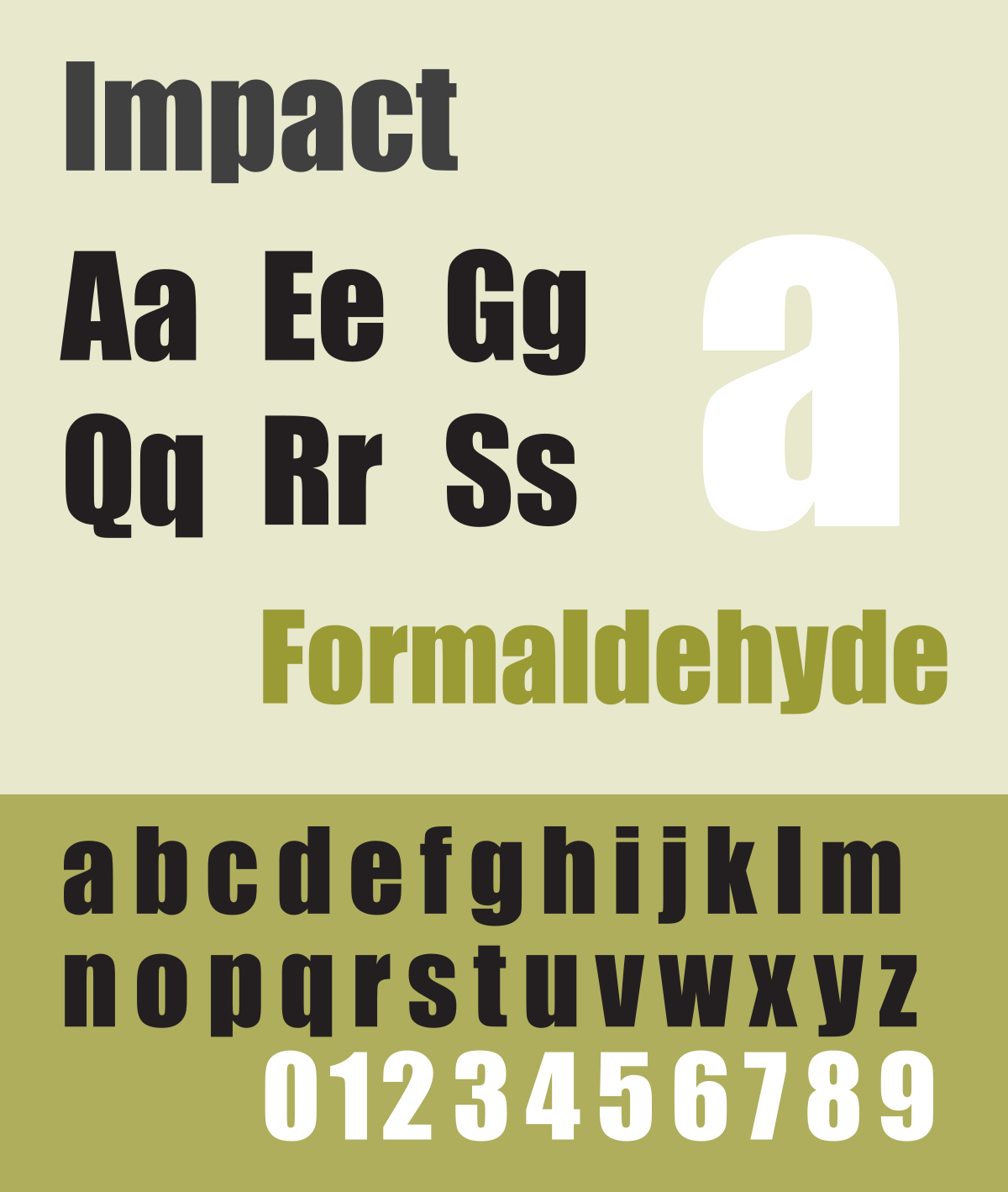
Impact
This font has a strong & oblong look to it. The impact font is intended to use it in all caps in headlines or headers but in body, it becomes hard to read which is bad for resumes as to make your resume fonts effective you need to make sure that everything is easy to read. That is the topmost priority.
How Do I Select The Best Font For My Resume?
The answer is simple.
Before making your resume think, what role are you applying for, what impression you want to have on the recruiter. The most important thing of all is which industry are you applying in.
There are also other factors to consider while selecting your resume which we have discussed below.
But, the first thing is to answer these simple questions, you can even write it down & then while selecting a font for your resume or CV you can make a list of fonts that you are interested in to use in your resume design. Then later think about selecting the best fonts for resume according to those points.
How To Choose Font From The Best Fonts For Resumes List? (Factors)
These are the factors which you should keep in mind when choosing a resume font for your resume from our best fonts for resumes list.
Readability
This by a wide margin is the most significant important point to keep in mind while picking a font for your resume. You won’t believe how many people choose the wrong font & they send it to their recruiter & things don’t work out as planned because their resume was not readable.
Some fonts were intended to look better on a screen, while others for a better print when printed.
Consider who is seeing your resume and how they are probably going to perceive you and your personality.
Goal
The font can set or change the whole sentiment of a resume. It also makes sure that the recruiter gets the message you are trying to send through your resume or CV.
Much the same as music can spark certain emotions inside you, so can a decent resume. A right font will help you stand out from the crowd right away. It will also give recruiters a basic idea of you & your personality.
So, make sure you choose the right resume fonts.
These are important factors which you should keep in mind while selecting a font for your resume or CV.
Conclusion
The font you decide for your resume will make a significant difference. Your resume needs have uniqueness,& professionalism. It should reflect you & your personality. Take your time to make your resume better.
Don’t rush into things, take your time to relax & think with an open and clear mind about what resume fonts to choose from.
Nobody is perfect but having an elegantly composed resume will play an important role.
